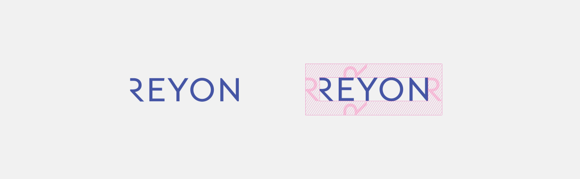
The primary identifier of REYON Pharmaceutical was designed to be a futuristic wordmark. The transparent and open letter 'R' means 'endless R', which symbolizes never-ending Research, Recovery of health, and a Relationship with the world.

- Research
- Recovery
- Relationship
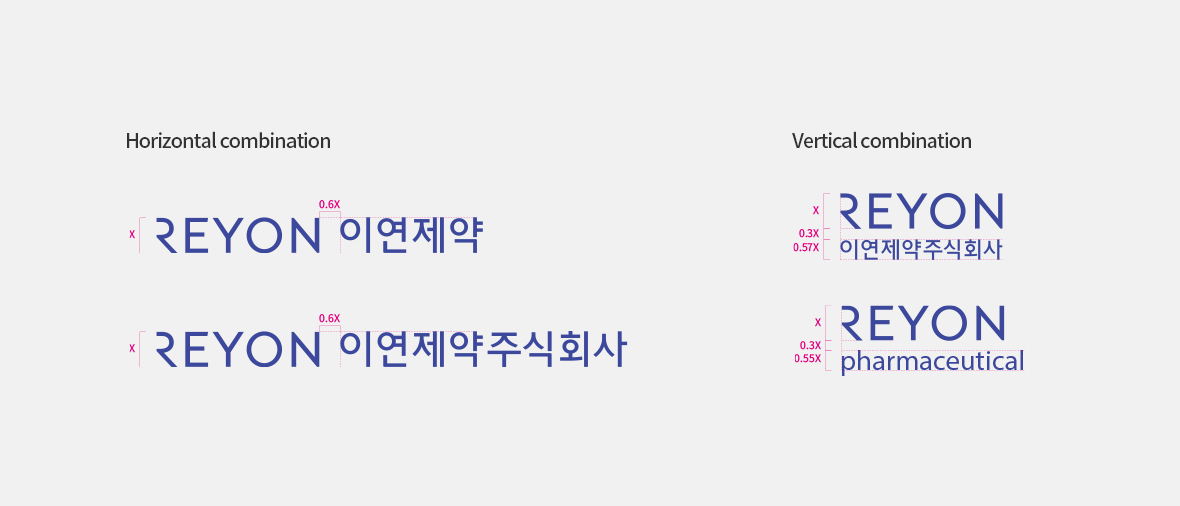
The logo type combination is carefully crafted considering harmony with the primary, so the logo type should not be enlarged or transformed and should be used as it is.
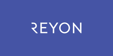
Exclusive colors can be used for various visuals. All productions are judged based on pantone colors. REYON Blue symbolizes professionalism and trust as a company that investigates the principles of life. It is mainly used as a primary and for point backgrounds to convey the presence of the brand.
Pantone. 2117C
Process Color. C84M76
RGB Color. R69 G85 B165
-
REYON Black
Pantone. Black C
Process Color. K100
RGB Color. R0 G0 B0
-
REYON Light Blue
Pantone. 2706 C
Process Color. C12M8
RGB Color. R219 G225 B242
-
REYON Gold
Pantone. 8005 C
-
REYON Silver
Pantone. 877 C
There are various examples that can be used for primary and secondary colors and special printing. Color is an important factor that directly affects REYON Pharmaceutical's brand image, so please read and follow the guidelines below.

-
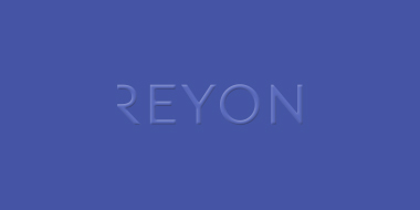
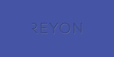
 REYON Blue / White
 -
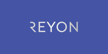 REYON Blue / Silver Leaf
 -
 REYON Blue / Embossed
 -
 REYON Blue / Engraved
 -
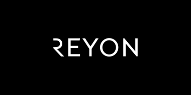 REYON Black / White
 -
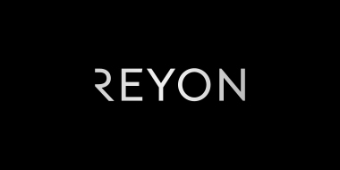 REYON Black / Silver Leaf
12F, Building A, Mirae Asset Tower, 620 Teheran-ro, Gangnam-gu, Seoul, Korea
Copyright©REYON PHARMACEUTICAL CO., LTD. All rights Reserved.